For the week commencing the 31st Jan my schedule said that I would be completing my first photo shoot to get the material for the three posters. I was successful in doing this as I completed the photo shoot on Friday and managed to gain successful images which I will be able to use for my products.

As the photoshoot wasn't until the end of the week and I had a number of free days I decided to use these well and complete some of next weeks work to give me more time to work on my posters. I managed to create the templates for three of the pages from my magazine and write and complete one of the articles meaning that one double page spread is close to completion. The contents page has it layout complete and some text added however it still needs completing with images etc.
As can be seen from the previous post, the photo shoot produced some good material which I will be able to edit and place into my posters next week.
Everything went to plan with the photo shoot, my models all arrived when asked to and brought what was needed. They were very co-operating so that really helped things go well meaning I didn't have to use any contigency planning.
I was lucky enough to speak to my client this week as he took part in my photo shoot and he said that he liked the look of my work and that he was looking forward to seeing the end product so I think they would be happy with my wrok for this week.
My products are beginning to take shape now so I feel I have made progress however I am going to have to use my frees and lunch times well and come and do extra work otherwise I probably will not reach the deadline.


 Over half term I had to work on getting my posters finished. I chose to do these because I have the photoshoop software at home and don't have InDesign so thought I could finish the magazine work the week after at college as the software is avaliable there. I had the images prepared previously so I needed to work on getting the layout correct then adding the text and and any other images. Once I got the text right for one poster I thought that it would be best to then copy this onto the other two to make sure that they were identical to make them all match and look better. I think the work has gone well as they are almost finished they just need a few final effects adding to make them look their best. these images show where they are at the moment. I have changed from my schedule slightly due to the the software avaliable however I should still be on track to complete everything on time. I think my client will be happy with the work I have done this week as they would be able to see the campaign beginning to come together.
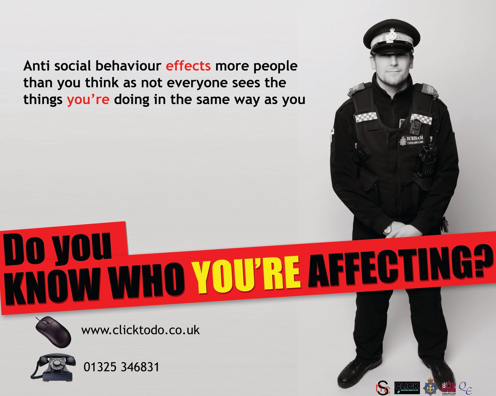
 In the previous week I had managed to find some spare time in order to do the InDesign work which I had scheduled for this week, this meant that I therefore have used this week to start editing the photographs taken in my first photoshoot for the poster and magazine front cover. I have prepared all three photos for the posters, one of which can be seen which has had the headline in its basic form added, you can also see the beginnning of the magazine front cover here. For the poster I tried cutting the image out and placing it on a plain white background however this didn't look right as the image was in black and white and the shadow effect needed to be carried on. I therefore used photoshop to carry the background all the way across to look like it was all photographed. this allowed for the natural shadow to stay which added extra feeling to the poster and improved the look.


 As the photoshoot wasn't until the end of the week and I had a number of free days I decided to use these well and complete some of next weeks work to give me more time to work on my posters. I managed to create the templates for three of the pages from my magazine and write and complete one of the articles meaning that one double page spread is close to completion. The contents page has it layout complete and some text added however it still needs completing with images etc.